February 08, 2022
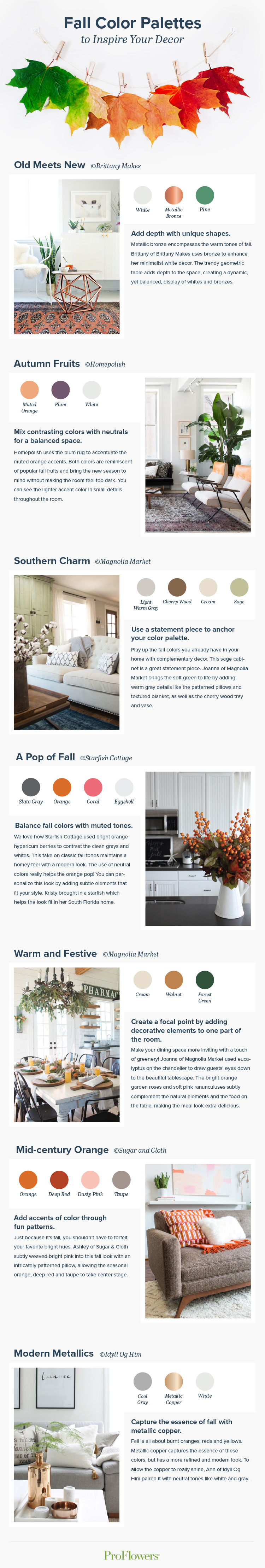
Fall Color Palettes to Inspire Your Decor
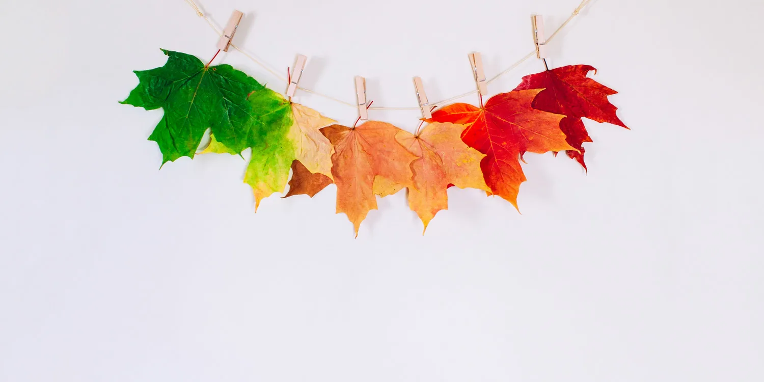

Are you looking for chic ways to incorporate fall colors? With the seasons quickly changing, it’s time to freshen up your home decor! We looked to our favorite bloggers for fall color palette inspiration. Why not try a few new color schemes for the new season? Of course, orange will forever be the color of the changing leaves, but gray green and plum can also help bring your living space from summer to autumn. Scroll down to see how these bloggers used moody fall tones while maintaining a bright and welcoming environment.
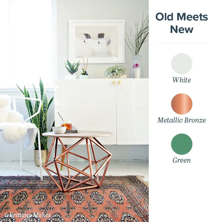
Pro Tip: Add depth with unique shapes.
Metallic bronze encompasses the warm tones of fall. Brittany of Brittany Makes uses bronze to enhance her minimalist white decor. The trendy geometric table adds depth to the space, creating a dynamic, yet balanced, display of whites and bronzes.
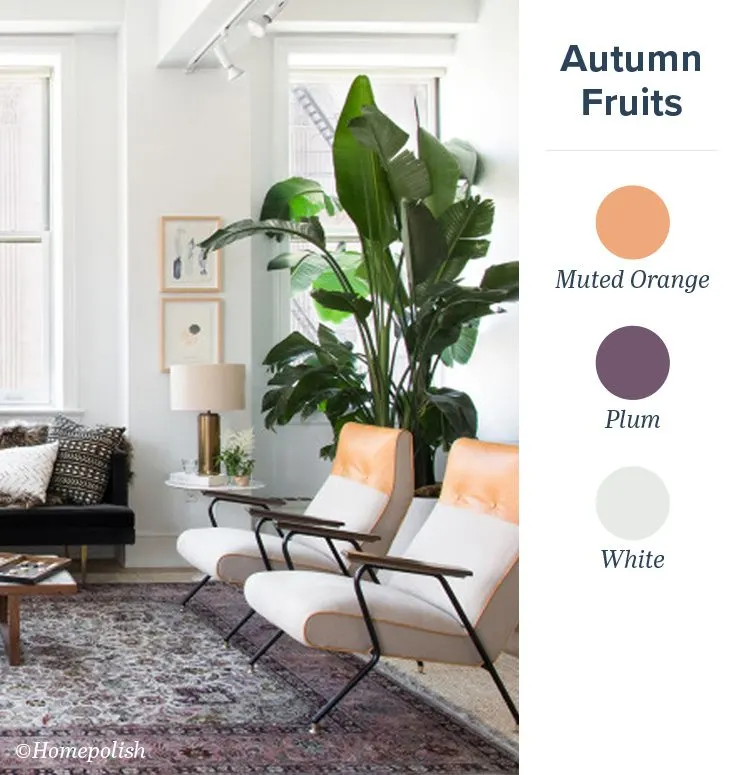
Pro Tip: Mix contrasting colors with neutrals for a balanced space.
Homepolish uses the plum rug to accentuate the muted orange accents. Both colors are reminiscent of popular fall fruits and bring the new season to mind without making the room feel too dark. You can see the lighter accent color in small details throughout the room.
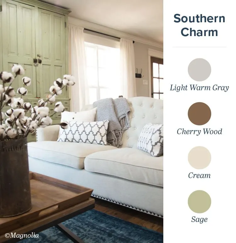
Pro Tip: Use a statement piece to anchor your color palette.
Play up the fall colors you already have in your home with complementary decor. This sage cabinet is a great statement piece. Joanna of Magnolia Market brings the soft green to life by adding warm gray details like the patterned pillows and textured blanket, as well as the cherry wood tray and vase.
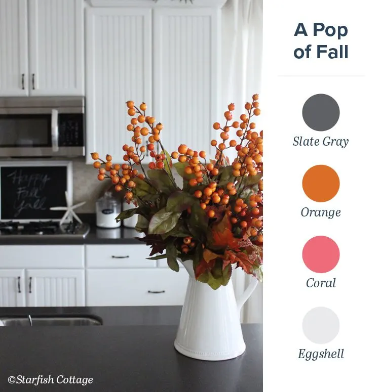
Pro Tip: Balance fall colors with muted tones.
We love how Starfish Cottage used bright orange hypericum berries to contrast the clean grays and whites. This take on classic fall tones maintains a homey feel with a modern look. The use of neutral colors really helps the orange pop! You can personalize this look by adding subtle elements that fit your style. Kristy brought in a starfish which helps the look fit in her South Florida home.
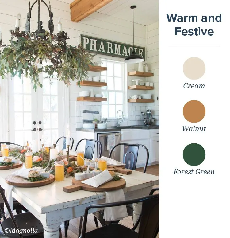
Pro Tip: Create a focal point by adding decorative elements to one part of the room.
Make your dining space more inviting with a touch of greenery! Joanna of Magnolia Market used eucalyptus on the chandelier to draw guests’ eyes down to the beautiful tablescape. The bright orange garden roses and soft pink ranunculuses subtly complement the natural elements and the food on the table, making the meal look extra delicious.

Pro Tip: Add accents of color through fun patterns.
Just because it’s fall, you shouldn’t have to forfeit your favorite bright hues. Ashley of Sugar & Cloth subtly weaved bright pink into this fall look with an intricately patterned pillow, allowing the seasonal orange, deep red and taupe to take center stage.
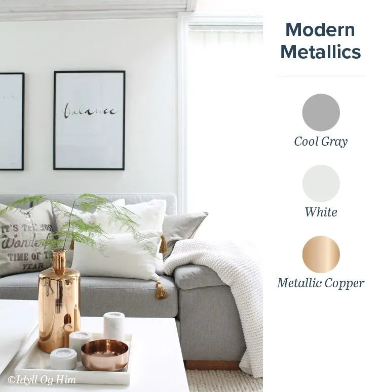
Pro Tip: Capture the essence of fall with metallic copper.
Fall is all about burnt oranges, reds and yellows. Metallic copper captures the essence of these colors, but has a more refined and modern look. To allow the copper to really shine, Ann of Idyll Og Him paired it with neutral tones like white and gray.
Now that you have beautiful fall colors to fill your living room, check out our fall flowers to make sure your trendy new space has fresh flowers to match.